
In December 1939, yellow ink flooded Chicago’s Southwest Side. Frank Reidy, my paternal grandfather, and his neighbors never saw it coming.
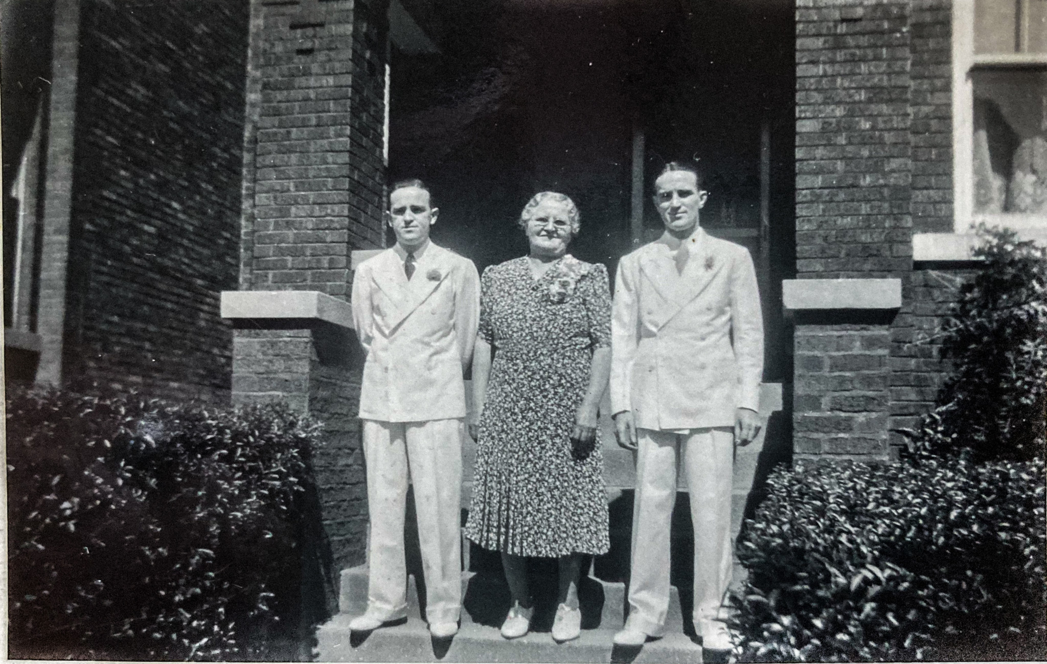
At the time, the twenty-four-year-old man was living with his Irish-immigrant parents at 64th Street and Maplewood Avenue in the Marquette Manor section of Chicago Lawn. Each weekday, Frank, short in stature with a wiry build, commuted five miles north and east of his parents’ brick bungalow to work at the Stockyards Station Post Office, where he earned sixty-five cents an hour as a substitute clerk.
While he worked his federal government job that December, another federal agency called the Home Owners’ Loan Corporation (HOLC) dispatched real-estate appraisers to survey Frank’s neighborhood: the value of its housing stock, the rents commanded by its landlords, the traffic volume on its numbered east-west streets and named north-south avenues, the earning power and ethnic make-up of its residents.
In Chicago, as in every city the HOLC surveyed, appraisers’ purported task was a neighborhood-by-neighborhood calculation of mortgage security: the likelihood that a home loan would be repaid without default. The evil lay less in the HOLC’s purpose so much as its methods. HOLC appraisers, many of whom were local real-estate men freelancing for the feds, saw the presence of Black and Latinx people in a given Chicago neighborhood as an inherent, decisive risk to the security of any mortgage loan made within its confines.
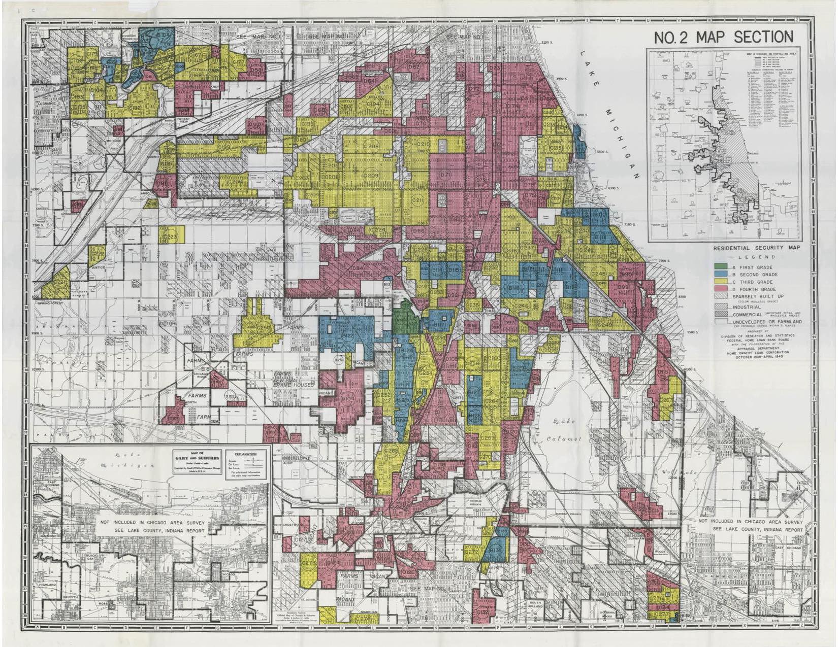
Home Owners’ Loan Corporation maps made the federal agency the original perpetrators of redlining. In metropolitan Chicago, twenty-nine percent of neighborhoods—home to thousands, mostly Black but also Latinx people—had been given a grade of D and dyed red on HOLC maps. By choosing red, that universal color of warning, the HOLC made visible and visceral the enormous mortgage-security risk presented, in the eyes of the agency and its appraisers, by even a small number of Black residents. Of a section of Woodlawn surveyed in October 1939, an HOLC appraiser wrote, “This is a semi-blighted area and while it is restricted to Whites… there is a constantly increasing encroachment of Negroes from both the west and south…. It is expected ultimately that this entire area will revert to the Colored race.” The HOLC gave the area, only one percent Black when it was surveyed, a D grade.
For decades to follow, redlined neighborhoods and their mostly Black residents were starved of credit and investment and robbed of opportunities to build wealth. The shamelessly unethical speculators who filled the void left by many traditional mortgage lenders gouged residents of redlined neighborhoods with predatory practices such as contract selling: arrangements under which Black Americans made unusually large down payments on exploitative sale prices and paid exorbitant interest rates while building no equity in their homes (which they did not technically own), all under constant threat of unjust eviction for a missed monthly installment. From extreme heat to rates of hospitalization related to COVID-19, new dimensions of the persistent damage done in neighborhoods graded D on HOLC maps are still emerging. Contention about the role of the federal government in redlining is at the heart of the ongoing debate about reparations for Black people in the United States.
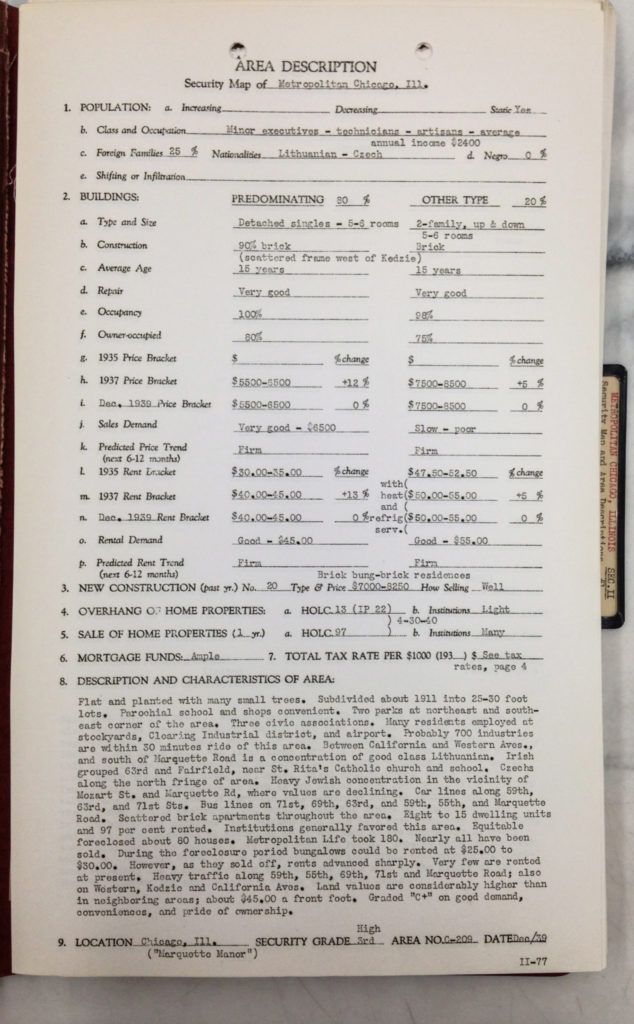
With more deliberation, and with less venom than they expressed toward Black and Latinx people, HOLC appraisers looked askance at lower- and working-class European ethnics they identified as “foreign,” seeing their presence as a significant but more tolerable risk to mortgage loans. On the same HOLC maps that sentenced residents of redlined neighborhoods to decades of deprivations, Frank Reidy’s Marquette Manor neighborhood and ten areas surrounding it were deemed Grade C—the third-rate grade on the HOLC’s four-grade scale of mortgage-loan security. Grade-C neighborhoods were stained yellow, a clear recommendation that mortgage lenders take caution and greater self-protective measures when considering and making loans in these areas.
Only recently have economists and scholars begun to recognize and debate the virulent effects of the HOLC’s Grade C designations. Today, for Black and Latinx residents of once yellowlined neighborhoods on the South and Southwest Sides of Chicago, a continuous, multi-decade trend of disinvestment that can be traced to HOLC yellowlining is made more perilous by a global pandemic that has exacerbated a pre-existing housing crisis, and by the risk of displacement should long-awaited investment arrive before effective affordable-housing measures are in place.
The Great Depression upended the home lending industry in the United States. In the early 1930s, home foreclosures in the nation’s cities reached a rate of about 1,000 per day.
From 1933 to 1936, the HOLC refinanced at favorable terms the distressed mortgages of more than one million homeowners. By July 1936, ten percent of non-farm mortgages in America had been refinanced by the HOLC. By means of these loans, the federal government found itself a major investor—to the tune of many billions of dollars—in urban residential real estate.
Having propped up the U.S. housing market, the HOLC set about protecting its investments. Federal banking officials had concluded in 1934 that “faulty property appraisals” were among the systemic weaknesses that had contributed to the Great Depression, according to a 2012 article by Louis Woods, an associate professor of African-American history at Middle Tennessee State University. The HOLC argued that the application of “scientific” rigor to residential appraisals would bring about a host of desirable outcomes: fewer foreclosures, greater housing-market stability, even a greater volume of mortgage lending. To foster the so-called science of appraisal, the HOLC evaluated mortgage security in 239 American cities, recording their findings on multicolor maps and in written descriptions of each polygonal tract. Surveyed neighborhoods were given a mortgage-security grade of A, B, C, or D.
Primarily in the context of their analyses of redlining, academics have long debated the most accurate way to assess the impact of HOLC maps. Researchers from the Federal Reserve Bank of Chicago show that HOLC mortgage-security maps contributed directly to a range of negative ramifications, including lower home-ownership rates and lower home values, in neighborhoods given grades of D (red) or C (yellow).
Woods asserts that the HOLC’s appraisal approach shaped the underwriting policies of the Federal Housing Administration (FHA), making it significantly less likely that residences located in neighborhoods populated by poor, nonwhite or identifiably ethnic inhabitants would receive FHA mortgage insurance, a gateway to lower interest rates and other favorable lending terms.
Amy Hillier, an associate professor at the University of Pennsylvania’s School of Social Policy & Practice, argues in a 2003 paper that HOLC maps reflected and endorsed the racist and anti-ethnic sentiments, as well as the discriminatory lending and real-estate practices, that had sown the seeds of urban decay before the maps themselves were created. Hillier called HOLC maps “probably the clearest, most accessible, and most dramatic evidence” of what she deemed “collusion” of private and federal real-estate bodies to ratify the exercise of “racial prejudice” in assessing mortgage security across American cities.
Scholars agree that the restriction or deprivation of credit experienced in neighborhoods given HOLC grades of C or D correlate strongly to a range of negative repercussions, from underinvestment and depressed housing values to, in the words of Chicago Fed researchers, “an array of social problems related to poverty.”
On HOLC maps, Frank Reidy’s family home was located at the heart of one of the largest contiguous Grade C areas south of Roosevelt Road. Four miles of 63rd Street, from Ashland west to Cicero, were yellowlined. Likewise, federal appraisers made an ironic yellow brick road of a one-and-a-half-mile stretch of Talman Avenue, from 51st Street south to 73rd Street. On the banks of this sea of C-grade housing were redlined neighborhoods, industrial areas, and land too sparsely developed to be graded.
A scan of the HOLC Map of the South Side of Chicago.In the official HOLC description of Frank Reidy’s Marquette Manor neighborhood, the appraiser gives the area a C+ rating, still third-rate despite the “good demand, conveniences, and pride of ownership” cited in the report. Appraisers took an even dimmer view of surrounding areas and their residents. An L-shaped, yellowlined plat covering parts of the New City and West Englewood community areas was described as “a rather poor third class.” Of the southern end of a yellowlined Englewood tract, an HOLC appraiser wrote, “In general, this is a low class neighborhood characterized by no pride of ownership, and is, at present, slipping.”
Residents of yellowlined neighborhoods would contend with forces much more potent than bureaucratic condescension. Borrowing costs in Grade C areas were often higher than those in areas graded A or B. The HOLC description of the aforementioned section of New City and West Englewood characterized its mortgage funds as “somewhat limited” and noted interest rates of six percent. By comparison, lenders made mortgage loans at five percent interest for homes across three sections of the Beverly neighborhood, the only areas south of Roosevelt Road to receive a Grade A designation on HOLC maps of Chicago. Mortgage-funding descriptions for two of the three sections of Beverly included the abbreviation “Ins.,” likely shorthand for mortgage insurance provided by the Federal Housing Authority. The availability of FHA insurance emboldened private lenders to offer mortgages at lower rates of interest and, according to Hillier, federally insured mortgages were easily resold on the secondary market.
In short, the more desirable a neighborhood was thought to be, the easier and less expensive it was (for white people deemed creditworthy) to get a mortgage there. The unattractive prospect of paying higher mortgage costs to live in a neighborhood considered less desirable paved the road to disinvestment in yellowlined areas.
The Chicago Federal Reserve’s side-by-side analysis of Grade C neighborhoods and Grade B neighborhoods reveal the magnitude and durability of the disinvestment that followed HOLC yellowlining. When the HOLC map of Chicago was published in 1940, homeownership rates on the borders between Grade C neighborhoods and Grade B neighborhoods across the United States were 4.7 percentage points lower on the yellowlined side. By 1960, the homeownership gap in Grade C-Grade B border areas had widened to seven percentage points. In 2010, homeownership rates along C-B borders on HOLC maps were still more than six percentage points lower on the yellowlined side.
Along these same Grade C-Grade B borders, home values on the yellowlined side still lagged in 2010.
Chicago Fed economists found that negative effects of HOLC maps were “larger and more persistent” along borders between Grade B neighborhoods and Grade C neighborhoods than they were along Grade C-Grade D borders.
Having identified the dual phenomenon of “restricted access to credit in yellow areas” and rising levels of racial segregation on the C side of borders between Grade C and Grade B neighborhoods, the Chicago Fed economists dubbed it “yellow-lining.”
From the mid-twentieth century into the twenty-first, many thousands of residents of neighborhoods yellowlined on HOLC maps have paid a price in dollars and opportunity.
Part of what makes the gaps between yellowlined neighborhoods and Grade B neighborhoods so galling are the factors, geometric and demographic, that the HOLC applied in determining its grades.
The authors of the Chicago Fed study of HOLC maps and their impact suggested that some blocks in Chicago may have been yellowlined for the convenience of those drawing the maps. Choosing railroad tracks and major thoroughfares as area boundaries likely proved more alluring for HOLC appraisers than did a conscientious investigation of intra-neighborhood variations in credit risk.
HOLC appraisers considered buildings’ attributes, including the age of the structures, recent sale prices, rents and occupancy rates, when assessing mortgage risk in a neighborhood. However, Woods argues that, in the HOLC’s determination of mortgage security, “the type of inhabitant was as important as the condition of the dwelling units under appraisal scrutiny.” He elaborated in an interview with the Weekly, saying that HOLC appraisers would have considered “Irish, Italian, Russian, and Jewish groups as infiltrators” into otherwise stable, desirable neighborhoods.
The presence of working-class ethnic European populations—who, in the words of scholar and author Elaine Lewinnek, were considered “not quite white” in 1930s America—led to the yellowlining of neighborhoods that might otherwise have received a B grade and benefited from easier access to credit.
HOLC area descriptions make the institution’s emphasis on race, ethnicity, and class abundantly clear. Field 1.b on the standard form was “Class and Occupation.” Field 1.c. asked for a percentage of “Foreign Families” and for their “Nationalities.” “Negro” was a separate category on the same line. In Frank Reidy’s Marquette Manor section of Chicago Lawn, the HOLC appraiser listed common occupations as “minor executives,” “technicians” and “artisans” and recorded $2,400—about $44,000 today—as the average annual household income. The appraiser declared twenty-five percent of Marquette Manor households “foreign,” making specific mention of Lithuanian and Czech nationalities.
Federal appraisers’ written descriptions of yellowlined neighborhoods across Chicago’s Southwest Side contained additional, potentially decisive notations—some veiled in their reference to ethnicity or class, some overt: “Heavy Italian concentration north and south of Marquette Road, from Ashland Ave. to Wood [Street]. Poor quality of improvements, adverse influences and low grade population indicate a ‘C-’ area.”
Sixty percent of residents of a yellowlined section of West Elsdon were deemed “foreign” by the HOLC. Many of them were Polish laborers, and average annual income in the neighborhood was estimated to be just $1,800 ($33,000 today). The appraiser assigned to West Elsdon made sure to note the “poor grade of population.”
In the description of Frank Reidy’s Chicago Lawn neighborhood, an HOLC appraiser wrote: “Heavy Jewish concentration in the vicinity of Mozart St. and Marquette Rd., where values are declining.” Along with declarations of a twenty-five percent “foreign” population of Czechs and Lithuanians and an average monthly income of only $200 ($3,670 today), anyone searching for the reasons why “good demand, conveniences, and pride of ownership” were not enough, in the eyes of the HOLC, for Marquette Manor to earn a B grade has found them.
By contrast, in each of the three Beverly neighborhoods given A grades, the HOLC described residents’ class and occupation as “Business and Professional” and pegged the “foreign” population at zero percent.
In the HOLC’s determination of mortgage security, neighborhood character was pivotal, and the institution’s concept of character boiled down to the race, ethnicity and class of residents. For the federal agency bent on protecting its investments in residential real estate, the primary problem in the Marquette Manor section of Chicago Lawn and in some other yellowlined neighborhoods was not the housing, but the people living in the houses.
Many ethnic European residents in America’s yellowlined neighborhoods saw their fortunes rise in the 1940s and 1950s. After World War II, white-ethnic people were granted many of the privileges of American whiteness, including low-cost home loans under the GI Bill. Many exercised their option to reside in suburbs fertilized with generous loans from legitimate lenders. Despite their military service, Black veterans living in America’s redlined neighborhoods were not given access to the housing and education advantages that white-ethnic veterans and their families enjoyed after World War II. That redlining’s disastrous consequences were intensified by other sweeping, contemporaneous, discriminatory policies is just one of the many reasons that redlining and yellowlining should not be conflated. Redlining was, and remains, the more vicious scourge.
Some white-ethnic Americans who remained in their pre-war neighborhoods used violence, mob action, and terror to influence local policymakers and prevent Black people from moving in. Black people who purchased homes in yellowlined neighborhoods often did so at inflated prices. The arrival, actual or seemingly imminent, of Black residents in a tenuously middle-class, white-ethnic neighborhood triggered an outmigration of its white residents—the exodus known as white flight. Disinvestment rooted in the restriction of credit under yellowlining deepened as white ethnics left their city enclaves and, in the words of writer Daniel Kay Hertz, who has contributed to the Weekly, “pulled every dollar out of the commercial life of their neighborhoods.” (Hertz is now the policy director for the city Department of Housing.)
Many whites who fled yellowlined neighborhoods were motivated by racism, surely. But author and reporter Ta-Nehisi Coates has argued for an understanding of white flight that looks beyond “a natural expression of preference.” Pointing to restrictive housing covenants, public investment in suburbs and interstate highways, and Home Owners’ Loan Corporation maps, Coates asserted in his essay “The Case for Reparations,” that “White flight was the policy of our federal, state, and local government,” too.
Chicago Fed economists claimed that HOLC maps “account for roughly half of the homeownership and house value gaps” from 1950 to 1980 between Grade C neighborhoods and neighborhoods given the preferred grade of B. These findings suggest that, even before and during periods of white flight, the HOLC maps themselves were a cause of depressed home values and home-ownership rates in yellowlined neighborhoods.
The neighborhoods of Chicago’s South and Southwest Sides are still being mapped, segmented, and rendered in meaningful colors.
Beginning in 2016, three civic organizations—the Chicago Metropolitan Area for Planning (CMAP), the Metropolitan Mayors’ Caucus, and the Metropolitan Planning Council—partnered with the Institute for Housing Studies (IHS) at DePaul University to divide the Chicago metropolitan area into eight housing submarkets. The stated purposes of the effort, known as Regional Housing Solutions (RHS), are to enable policymakers, elected officials and community organizations to “understand the variation in local housing submarkets, identify where common housing challenges exist across the region, and determine the best strategies to address those challenges.”
The results of the enormous quantitative and qualitative analysis are readily accessible at regionalhousingsolutions.org. On the site’s home page, I entered the address at which Frank Reidy had resided in the Marquette Manor section of Chicago Lawn. Today, on the variegated RHS map, my grandfather’s childhood home is identified as part of Submarket 1.
RHS characterizes Submarket 1 neighborhoods in stark terms: “a high distress area with higher levels of foreclosure and vacancy,” “low levels of mortgage investment and high levels of cash sales,” and “an older housing stock.” Descriptions of the people who live in Submarket 1 neighborhoods are similarly blunt: “Educational attainment levels are low, and households in this submarket are lower income with the largest income declines of any of the submarkets.”
The color given to Submarket 1 housing on RHS maps is yellow.
Just twenty-one percent of Chicago and two percent of the metro area are included in Submarket 1, but some neighborhoods on the South Side are almost entirely yellow on RHS maps: all of the Englewood, Oakland, Washington Park, and Woodlawn community areas, ninety-nine percent of West Englewood and Fuller Park, and ninety-three percent of Greater Grand Crossing.
Benign stated intentions.
The stratification of urban neighborhoods.
Descriptions of residents in socioeconomic terms.
Is the Regional Housing Solutions effort a reincarnation of redlining and yellowlining on Chicago’s South and Southwest Sides? Not exactly. First, when describing neighborhoods and their residents, RHS avoids the racial and ethnic characterizations essential to the HOLC grading scheme. Second, while HOLC maps were largely hidden from the non-lending public, RHS has pursued transparency, publishing not only its map but a spreadsheet of its data sources and a detailed description of the submarket-clustering process. Third, whereas the HOLC consulted few outside the lending industry when grading urban areas, the organizations behind RHS engaged neighborhood residents. Geoff Smith, executive director of the IHS, told the Weekly, “We did a lot of data validation of sorts, talking to folks on the ground from these different types of communities to get their take on, ‘Does this represent what you see as your neighborhood?’”
Community housing organizations, too, see the RHS effort’s potential for good. Deborah Moore is director of neighborhood strategy and planning for Neighborhood Housing Services (NHS) of Chicago, a “nonprofit neighborhood revitalization organization” that operates in communities across Chicago’s South and Southwest Sides, including Frank Reidy’s former neighborhood of Chicago Lawn. In an email to the Weekly, Moore characterized the RHS effort as “an interesting high-level resource for better understanding the conditions impacting the communities we serve” and “a nice clearinghouse for sharing planning and community development tools” across municipal boundaries. Moore noted that NHS of Chicago works closely with the civic organizations behind the RHS effort.
For her part, Moore sees crucial differences between the RHS mapping effort and that of the Home Owners’ Loan Corporation, whose maps, she wrote, “were predicated on the notion of mitigating risk, but most of that ‘risk’ was based on racial and ethnic fears. [HOLC maps] were deliberate tools of exclusion.”
The history and legacy of both redlining and yellowlining suggest that reasonable intentions may not be enough, however, to protect already disadvantaged communities from the inherent dangers of mapping urban neighborhoods through a real-estate lens and describing their residents in terms of class. Even supporters of the Regional Housing Solutions effort recognize the potential for its misuse.
“With so much data now available at our fingertips,” Moore wrote, “there [is] always a risk that it could be abused or misunderstood.”
“It’s possible,” Smith said, “that someone might look at the map and be like, ‘Hey, I don’t want to make a loan there now because it’s [Submarket] 1.’ I don’t think that’s going to be how [the RHS submarket maps] are used, hopefully, or how they have been used.” Community engagement, Smith said, helps to ensure “we’re telling the right story with the maps and that there’s a positive application at the end of the day.”
In the 2020s, the perils facing formerly yellowlined and redlined neighborhoods on Chicago’s South and Southwest Sides are not limited to continued underinvestment. The RHS highlights that, because of their proximity to the Loop, access to public transportation, and lower land values, some communities in Submarket 1 face the prospect of “rapid neighborhood change,” also known as gentrification.
In 2017, the IHS published “Mapping Displacement Pressure in Chicago,” a map and accompanying analysis that identify areas where current residents may not be able to afford the rising housing costs that accompany development. After an update using 2019 data, a handful of neighborhoods south of Roosevelt Road—three separate sections of Bridgeport, a sliver of Hyde Park, part of Pilsen, and the Near South Side between Chinatown and the Lakefront—are considered at high risk of seeing their residents displaced. In these neighborhoods, rising housing prices have besieged vulnerable populations: lower-income renters, families and seniors who already dedicate a considerable percentage of their income to housing costs. Displacement is already underway in high-risk areas, and opportunities to stop or slow it are limited.
The updated IHS analysis found that residents of sections of the Oakland, New City, Gage Park, Chicago Lawn, Douglas, Grand Boulevard, South Shore, and Woodlawn community areas are at moderate risk of displacement due to rapid development. Driving displacement risk in many of these areas is easy access to public transportation that an influx of higher-income residents could use to reach the central business district. Smith said that housing advocates and city officials “still have some opportunity to get ahead of lost affordability or displacement pressure” in moderate-risk neighborhoods. “But,” Smith continued, “if you have a big project like… the Obama Presidential Center or something that’s going to drive rapid increases in demand, then you have to be proactive in those areas to preserve that affordability.”
Frank Reidy’s former residence on Maplewood Avenue is part of an area now more than ninety-five percent non-white. The IHS deems this tract of Chicago Lawn at low risk of displacement. As is the case in other areas in the low-displacement-risk category—among them sections of West Englewood, Englewood, South Chicago, Greater Grand Crossing, and Auburn Gresham—housing prices are rising significantly in parts of Frank Reidy’s old stomping grounds, but not to a degree that displacement seems imminent, even for residents who spend a large portion of their income on housing. The extended development timeline in communities at low risk of displacement presents opportunities, Geoff Smith said, “to be more creative in the way you try to preserve that affordability.” According to the IHS, strategies for maintaining affordable housing in such areas include helping renters become homeowners, as well as purchasing vacant or low-cost land and earmarking it for “community ownership.”
A “more critical concern” in neighborhoods at low risk of displacement, according to the IHS analysis, is “long-term disinvestment.” That disinvestment endures as a threat in Frank Reidy’s erstwhile neighborhood and in many Chicago neighborhoods south of 47th Street is a legacy of white flight and redlining, certainly, but also of yellowlining that made mortgage loans more costly in already less desirable areas.
Might findings about the federal role in yellowlining further fortify arguments that the federal government should be held accountable for the extraction of housing wealth from redlined Black communities in American cities?
On an overcast Sunday afternoon in January 2020, I started out by car from 41st and Halsted, site of the Stockyards Station post office where Frank Reidy had worked as a clerk. The roads were wet, as if they had been sprayed down. The hiss of tires rolling over water announced every moving vehicle. A dusting of snow partially concealed sidewalks and dormant grass.
I drove down Racine Avenue along the eastern edge of Sherman Park. Two basketball courts sat empty in a thick grove of trees. At Garfield Boulevard, I turned west. In December 1939, an HOLC appraiser had described this strip of Garfield Boulevard as “the ‘gold coast’ of this area, with many brick apartment buildings and a fine planting of trees and park area in the middle of the street” before giving the surrounding neighborhood, populated in part by Czech members of the “laboring class” and with an average annual income of only $1,800 ($33,000 today), a C-minus grade. Even in winter, eighty years after that description was written, the landscape architecture of the boulevard was still appealing.
Upon reaching Ashland Avenue, I turned south and drove a mile of borderland between two sections of West Englewood—one that had been yellowlined and another that had been redlined—the type of boundary Chicago Fed researchers had studied to discern the effects of HOLC grades. The HOLC’s description of the Grade D section between Garfield Boulevard and 63rd Street offered examples of their appraisers’ contempt for working-class European immigrants—“many foreigners, Irish and Italians predominant…. The better class (or ‘lace-curtain’) Irish have moved south”—and of the militaristic vitriol they reserved for Black people: “A Property Owners’ Organization is endeavoring to hold that portion between 59th and 64th, Green to Carpenter, against colored infiltration.”
At 63rd Street, I headed west toward the Marquette Manor section of Chicago Lawn, into the four-mile-wide swath of Chicago’s Southwest Side that the HOLC had yellowlined. Some of Marquette Manor’s one-way streets were under surveillance. At 66th and Maplewood, a camera, encased in a hemisphere of plastic, was mounted on a gray steel pole beneath sensors and transmitters—an installation of the city’s ShotSpotter technology, perhaps. A similar apparatus kept watch at 64th and Rockwell.
On a steel placard atop a curbside pole tilted at eighty degrees, in red and blue type, the 65th and Rockwell block club welcomed visitors and alliteratively laid out the ground rules: no loitering, littering, soliciting, or speeding. With its sign, the block club requested careful driving and awareness of playing children before thanking visitors for their cooperation.
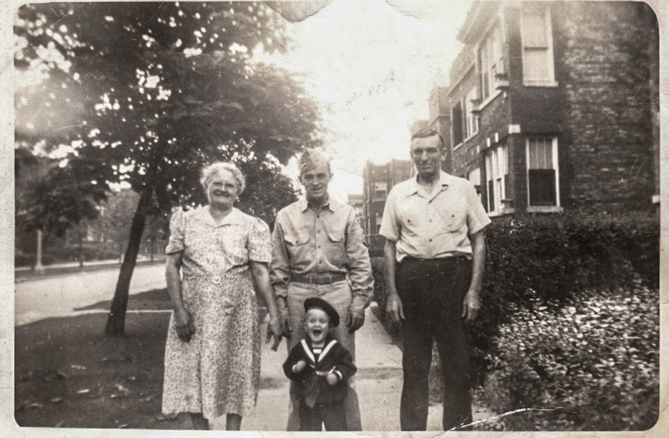
Just south of 64th Street on Maplewood Avenue, I found the brick bungalow that Frank Reidy had shared with his parents. To my knowledge, I had never laid eyes on the structure before. Decades had passed since any Reidy owned it. Having returned from serving in the Army during World War II, Frank Reidy was still living in the Maplewood house when his father Daniel, a native of Ireland’s County Clare and a retired Chicago firefighter, died in November 1946. In 1949, Frank moved about three miles south and west to a modest home on West 83rd Place in the Ashburn community area, where he would live for more than twenty years. Frank’s mother Margaret, also from Clare, stayed in the Maplewood house until she died in May 1963 at the age of 91. One of Frank’s brothers and his family remained in residence on Maplewood for some time after Margaret’s death.
On this January day, the trim around the Maplewood house’s three front windows shone as brightly white as the snow coating the roof. Behind the glass panes, white shades were drawn. A gray-shingled dormer with three small windows of its own looked a miniature of the façade beneath it.
A densely needled pine tree nearly twice the bungalow’s height loomed over its northwest corner. That the conifer had grown so tall only a couple of feet from the house’s exterior wall seemed a miracle. Branches hung across the bungalow’s front stoop. Any adult climbing or descending the seven cement steps would have had to duck the pine’s lowest boughs. Even this magnificent, anomalous tree seemed to my eyes another challenge for residents of once yellowlined Chicago Lawn.
Dave Reidy is the author of two books, including The Voiceover Artist: A Novel.
My grandfather was Daniel Reidy married to Florence Beldina Anna Rita Rose Reidy. Joan Reidy Boyd is my mother. Great work on this story. I love seeing photos of Maggie Doody Reidy. Thank you for this.
Your journalism is excellent and I very much appreciate it! This type of work reminds me of the old Chicago Reporter and is “journalism for journalists” and would be great instruction material for journalism students. Thanks!