
At first glance, the Whole Foods Market on the corner of 63rd Street and Halsted Street looks like any other. Look a little closer, though, and surprising details begin to surface. The new grocery store, which opened in late September, showcases subtle design elements, courtesy of the interior design firm 555 International and its mastermind, James Geier. From the train track motifs on aisle signs that reference Englewood’s history as a railroad hub, to the geometric patterns that mark the checkout counter numbers, the store is strung together by visual threads interwoven by Geier and his team.
The Englewood Whole Foods Market, now the center of attention in the Englewood Square retail complex, has perhaps been one of the most discussed developments on the South Side in recent years. When its arrival was announced in September 2013, the news sparked vigorous conversation within the neighborhood: some were concerned about how the development would take into account the existing community, but there was also healthy optimism that the opening of the store—which was joined simultaneously by a Starbucks and a Chipotle—would spark a commercial renaissance in the area. The location’s past identity as the Englewood Shopping Center, one of the busiest shopping districts in Chicago during the late 1800s into the mid-1900s, anchored by department stores like Sears and Kresge’s, set a precedent for a hope of returned glory: that the introduction of national retailers and chains will introduce a healthy sprouting of local businesses in response to the increased foot traffic. As far back as 2013, Whole Foods was already making strides to consult community organizations and urban farming communities in Englewood to address concerns about community collaboration. At the opening ceremony on September 28, while Mayor Rahm Emanuel and the then co-CEO of Whole Foods, Walter Robb, were present, so too were community organizers who had been involved in this consultation process. Though the store’s architecture has been criticized for disrupting the flow of commerce in the area and positioning the store as a bastion apart from the community, it nevertheless carries products from local suppliers and maintains a locally focused recruitment program—evidence that community engagement was indeed factored into the development process.
A focus on the local is not unfamiliar to Geier, whose company, 555 International, has been based in Back of the Yards for the last thirty years. Geier speaks of 555’s long-standing presence on the South Side with pride; it’s part of the reason he chose to take on the Englewood Whole Foods project in the first place.
“When you go deep into…what should be important about this store, whether it’s in Streeterville, or Schaumburg, or Englewood, [it] really comes down to them wanting to make sure that there’s some hook or connection to the ‘why?,’” Geier says. “So when people walk in, it’s not something completely foreign, but it’s also not one typical-looking Albertsons or Jewel [Osco]…That’s the excitement that comes with the community … Local is something that Whole Foods puts a lot of importance on…Being an employer of local people here for many, many years, it’s not easy to be a manufacturer and employ people in the city, but we’re very proud of being local and city-based, South Side-based, so that was also really important to want to take on that challenge.”

Yet, for a firm that is known more for its extensive work for brands on the luxury end of the scale—555 has been responsible for the interior design of restaurants like The Girl and The Goat, and retails stores like Gucci—a venture like the Englewood Whole Foods seems out of place. A grocery store was something entirely new for Geier and his team, much more quotidian in function and somewhat incongruent with the design firm’s portfolio. Geier, however, insists otherwise.
“I think the fallacy in our world is that we [555] only work for premium brands and premium projects,” he says. “And I say that’s the fallacy because a lot of the names are names that are recognizable because they’re good at their business. But not all of our projects are very high-end with huge budgets.”
“We focused on the fact that prior to there being anything there, there was a big oak forest. A big huge forest, and ultimately because Chicago is in the Midwest and all the railroads kind of started to come and go from here and the stockyards and all that,” he explains. “That area then turned into a very important transportation hub for railroads, both for people working and for freight.” These two moments in Englewood’s history ultimately became the anchoring visual inspirations for the store, with key motifs like the silhouettes of trees and branches, and recurring railroad elements found throughout signage, logos, and materials used.
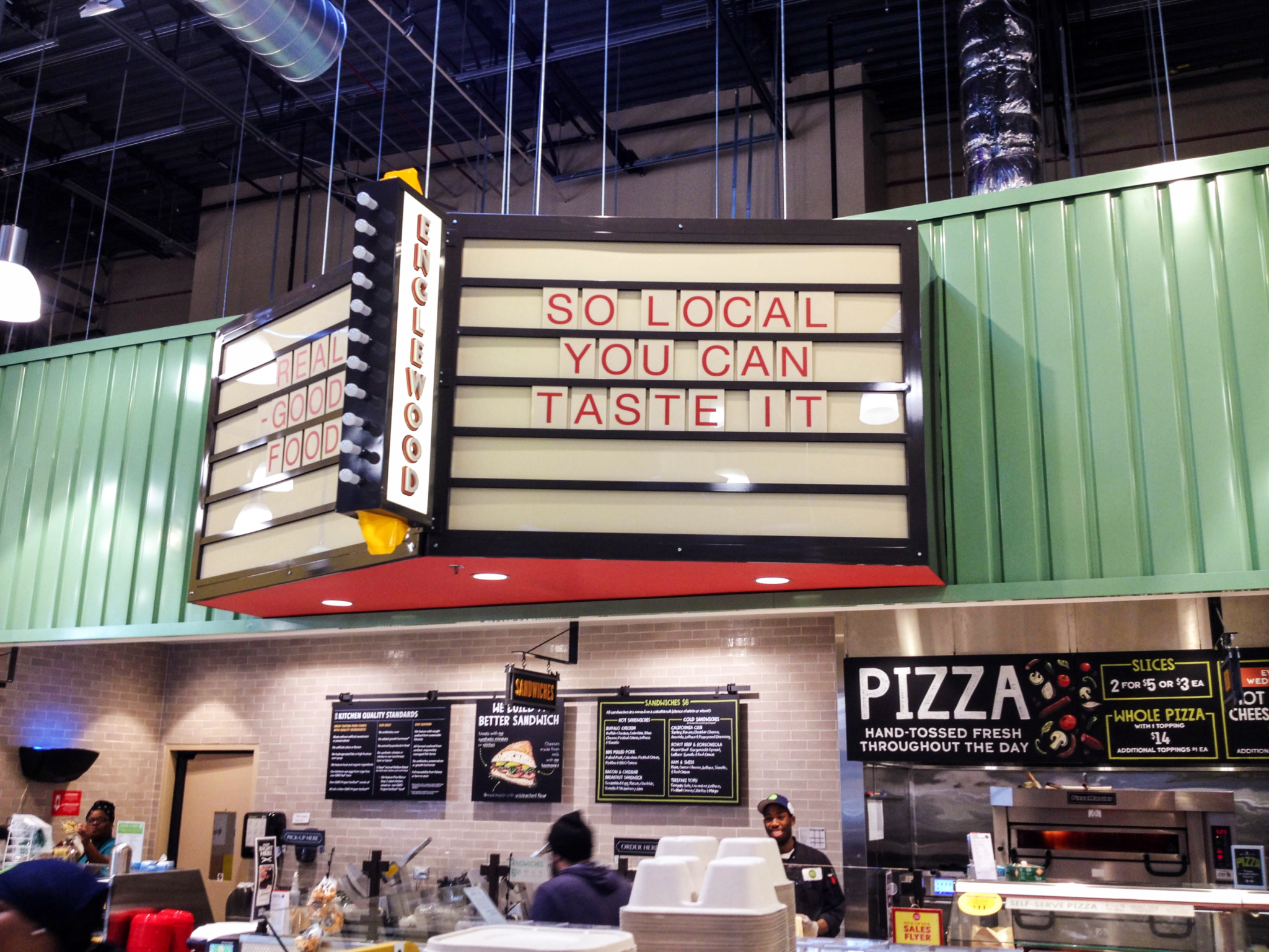
Overall, the design elements of the store are meant to be an understated blend of the Whole Foods brand identity and touches of locality that situate the store in Englewood. The most obvious visual feature is a series of black and white photographs of historical Englewood, accompanied by two panels of text that explain the area’s past as a vast expanse of oak forest, then as a transportation hub in the 1800s, beginning with the naming of Junction Grove from where a confluence of railroads had been. Behind these pictures, two large white silhouettes of oak trees rise toward the ceiling, and next to it, a tableau of intersecting lines mimicking the crossings of railway tracks. Apart from this statement piece, the railroad and forest motifs appear throughout the store in a decidedly more muted tone.
According to Geier, the entire process of designing the store, from sketches to when the final bolts were screwed in place, took about a year. The layout of the plan, preset by Whole Foods and familiar in many supermarkets, guides shoppers through a loose but pre-established route. In this case, that route is complemented by a chronological progression through Englewood’s history.
“If you were to go back to the store …you’ll notice, starting from the facades when you walk into the different departments, go all the way around the perimeter and then to the cash register, and you’ll start to see how so many of these periods have changed,” Geier said. “And those facades are just kind of emulating and harking back to some interesting times and kind of trying to set that tone.”
Throughout the store, clues to Englewood’s past are located in the details. The signage for the bakery section—red and white capitalized letters—is mounted on a pale green background. It takes a while to notice that the sign is made from the same material as shipping containers—the same containers that presumably were found on the backs of trains that passed through Englewood in its days as a freight center, and the same containers that can still be seen on 63rd Street between Calumet Avenue and State Street. The various labels above the refrigerated sections all bear the same railway markings that are present on the large visual tableau, and walking into the ready-meal section of the store, a marquee with “Englewood” bolted onto its side is reminiscent of those seen around the area in the early to mid-1900s, when the 63rd and Halsted commercial corridor was a thriving shopping district
Yet, while weaving this past into the visual design of the store does help localize the Whole Foods Market, it locates it in a distant history that seems almost too far removed from the Englewood of today. The Englewood that was a bustling railway hub in the nineteenth and early twentieth centuries was a predominantly white neighborhood of industrial laborers, one that predates the white flight and deindustrialization of the twentieth century. In this sense, the historical design on display doesn’t tell the stories of current residents.
Geier explains the chronological focus of the design by saying, “We don’t necessarily want to look at what Englewood was and what it is now and what it could be. What we decided to do was look at what Englewood was at the beginning…and the history of the settling of that area, that community…and kind of jump from the beginning to now, and not worry so much about the in between.”
While this explains the relative historical distance of the overall design of the store, it doesn’t fully justify it. What saves the design from complete disconnection to current-day Englewood are the decidedly contemporary community touches that Geier’s team also incorporated in the final design. Artwork by Jerrold Anderson, known popularly as Just Flo, a hip-hop and visual artist whose mural work can be found throughout the South Side, now decorates a wall near the checkout area. Anderson’s large mural of a young boy biting into a green apple was part of an open call for local artists’ work. The incorporated artwork also includes drawings by Chicago Public School students of their favorite fruits and vegetables, which Geier and his team turned into wallpaper that papers the community room.
Considering the scrutiny leveled on its process of development, these community touches to the internal design are reassuring. Coupled with the active initiatives that Whole Foods has introduced to this location—such as hiring locally, stocking local products, and establishing a community room—they’re a welcome step in the direction of community involvement and assuaging some doubt regarding the introduction of an establishment like Whole Foods in the neighborhood.

For Geier, the notion that design reaches beyond simply the visual and affects function and purpose has always been present. When he talked about the CPS student wallpaper in the community room, he said that it was “an important thing that they could feel comfortable coming to and feeling a good part of.” Bringing contemporary community elements into the space, then, was also meant to more pointedly assert a communal feel about the place, a level of comfort that somewhat alleviates the distanced external position of the Whole Foods building from the street and the community.”
For skeptics, the interior design of the store may perhaps matter less than any of the current active measures that Whole Foods enacts to engage the community. After all, how much can a couple of metal panels and well-cut logos do to impact the way Whole Foods interacts with the Englewood community? To that end, it’s worth noting that no one is claiming the interior design of the store is the sole vehicle to community engagement or change, but Geier does take an optimistic view about the abilities of good design.
“It’s been proven that good design wins, and I don’t mean just wins awards,” said Geier. “I mean does a lot of good important things.”
Customers of the Whole Foods in Englewood seem to be taking positively to the store as well. Shopping there on a Saturday morning, fifty-nine-year-old Brenda Blair, a resident of 114th Street, commented, “Oh, I think it’s awesome. It’s my third time coming here and I live in the hundreds.”
While there is no way yet to know how the presence of this Whole Foods will affect the Englewood community in the long term, for now, walking through the store is an exercise in subtle reminders of Englewood’s past and present.